Digital menu board solution for restaurants
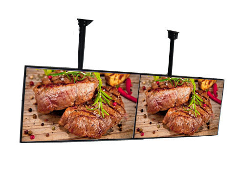
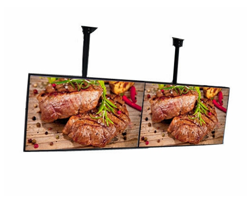
Solution for restaurants, fast-food and other franchises including gas stations, allows for a flexible menu to be customized to the time of day, geographic location, days of the week or weather, resulting in better decision making by the customer and increased sales. The solution consists of high-resolution commercial grade high brightness lcd monitors with matching bezels and adapted to the continuous operation in harsh conditions. These displays are equipped with built-in, professional grade players with passive cooling requiring no additional space or other considerations. This reduces device downtime while increasing service life and easier and faster servicing. A specially designed fastening system with low weight also ensures easy installation and service.
The article highlighted the consumer’s frustration with the menu, detailing that the customer, in this case, wasn’t just “hangry,” but frustrated. Seems the lightning-fast digital menu animation gave him just seconds to see, then recall the name of the item he really wanted to try. As a result, the customer ended up ordering an item he was familiar with, instead of getting to try the new chicken sandwich he really wanted.
Imagine the overall dissatisfaction in having to settle for that standard burger, when you really wanted the chicken — especially as you see that desired sandwich flash across the menu as you pull away. A real bummer, to be sure, as well as an instance that prompts the question: What is the goal of digital menus’ animated content after all?
We want to empower customers to find what appeals to their appetite, right? In limited-service settings, we want to help guests make quick decisions, while helping them to feel confident in their selections, but also keeping the whole process simple and quick. And there, too, some limited-service concepts get in their own way by choosing poorly designed printed menus.
For instance, on a recent trip to a growing Mediterranean fast-causal chain, where guests pick up small printed to-go menus to choose their orders as they approach the counter, I watched some guests step out of line to analyze calorie counts. Health-conscious customers went on to their mobile browsers to find nutritional values for specific items that were part of each meal. More info, please!
Another couple made their way to the order counter where they conversed with one another about different options on the tiny paper handout. The line and frustration built as the couple asked the order-taker what was included with each meal. It literally took 10 minutes for the one order! So, where were the pictures anyway? Show me that tilapia with caper-dill sauce, please!
When digital menus rush the customer
Now let’s talk about slowing things down a bit. Digital menus can be stellar for giving us visuals and appealing to our taste buds. But what happens when the flash animation is too fast?
I consider myself a fast reader but it can easily turn into a game of “who saw it first?” As mentioned in the aforementioned Wall Street Journal article, customers want a realistic opportunity to see the menu, but not have to chase down or wait for the content they really want to reappear. “Now you see me… now you don’t” tactics do not lend themselves to a satisfying ordering experience.
When trying to improve the bottom line with any menu design, a balance of information, animation and animation speed is the bottom line goal. Over the course of working with numerous brands of all sizes, we’ve tracked the sales data and talked to restaurant operators about what most pleases their customers in this area of daily operation.
What’s really working?
Well, printed menus just don’t do this customer need justice anymore, especially with growing concerns about sustainability and waste. However, brands and customers can both win when animation and imagery is used for featured items.
So though it may seem obvious, give some real thought to the time your content actually stays on screen before customers and make sure you’re keeping it in front of their eyes long enough for the average customer to make a decision and selections. This is absolutely essential to your QSR’s customer experience because it cuts ordering complications and empowers consumer tastes.

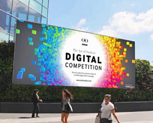
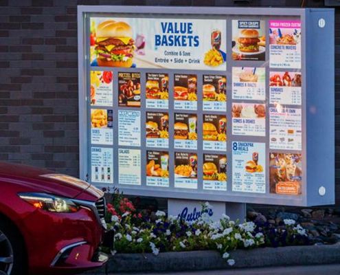
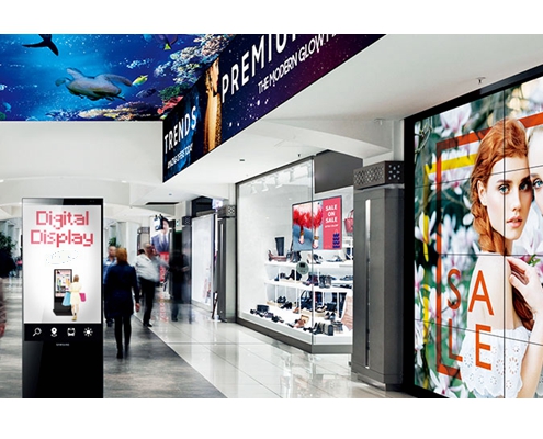
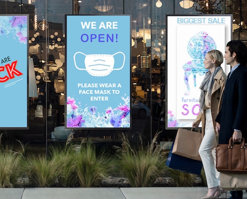
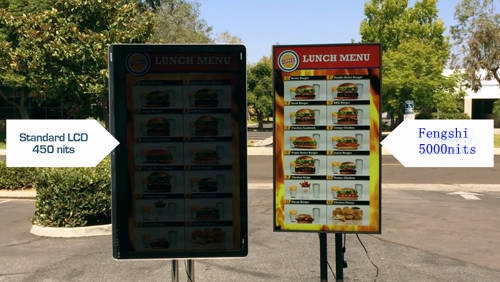 Why do you need a Sunlight Readable LCD screen?
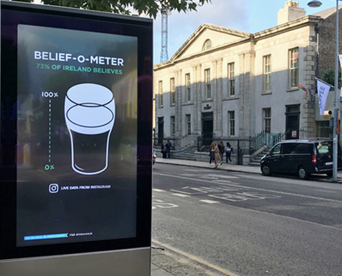
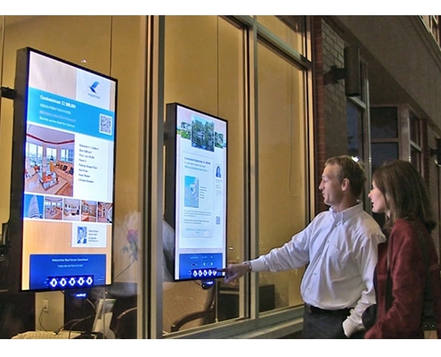
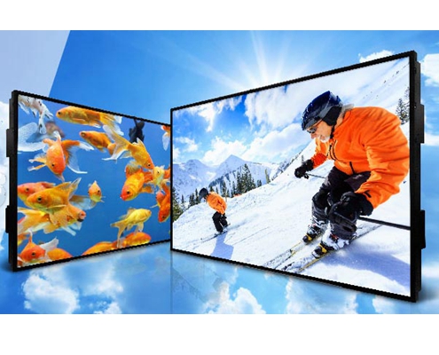
 Fengshi LCD CNNLCD now we have 10.1inch~98inch LCD panel with brightness of 700nits~5000nits We offering customized service according to the size and brightness of customers’ needs. Special launch 4K HD high brightness LCD panel, ultra high brightness LCD panel.Full outdoor lcd display, window facing display, digital menu board, open frame display.Fengshi independently designed the aluminum structure of the high brightness LCD Module with good thermal conductivity, straight edge structure and better brightness uniformity. Combined with a new generation of high brightness and energy-saving backlight modules, it is the best choice to outdoor high brightness LCD panel.
